This case study focuses on design-thinking and problem-solving approaches. Project-specific details are intentionally abstracted or omitted.
crafting an intuitive user experience for a GIS-based incident solution
UX RESEARCH & PRODUCT DESIGN (2024-2025)
#B2B
#SaaS
#WebApp
#SpaceTech
“My biggest takeaway was learning how to articulate design decisions with stakeholders and other nondesigners.”
PROJECT BACKGROUND
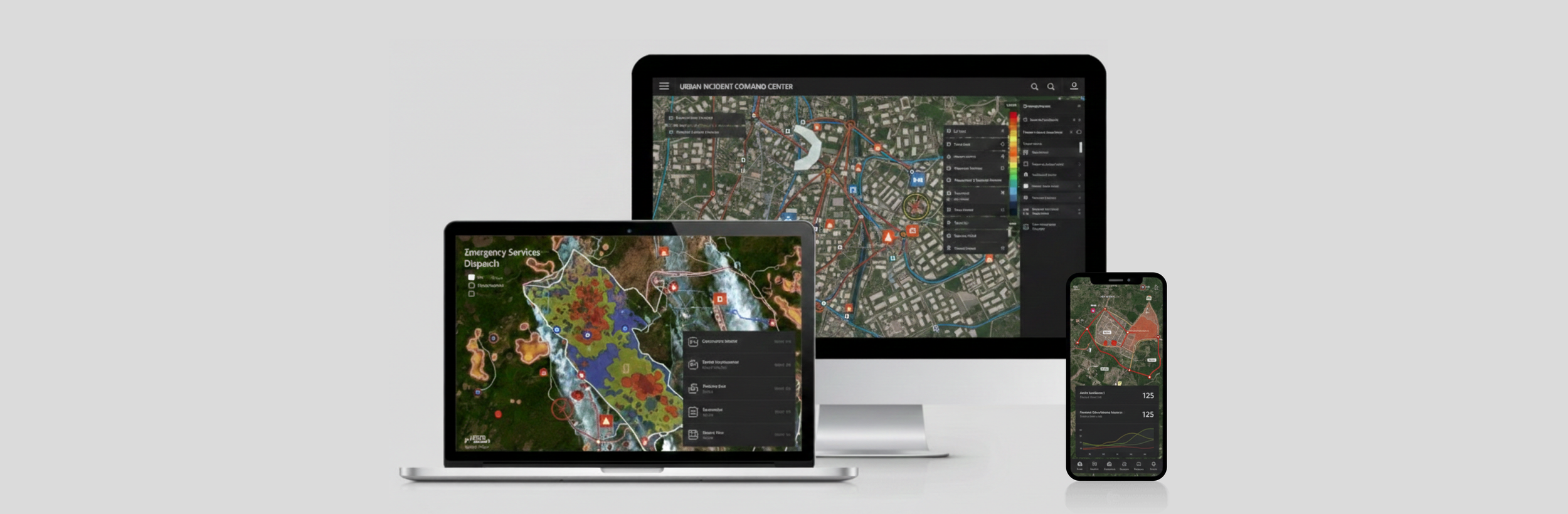
As the sole UX/UI designer at a SpaceTech scaleup, I design an intuitive, user-centered interface for a B2B SaaS platform that helps wildfire response teams make faster, data-driven decisions. My key responsibilities include:
Features Refinement: Continuously improving product functionality based on user feedback.
Measure UX: Conducting user research and defining UX metrics to measure the user experience.
1. FEATURES REFINEMENT
Overview
In my role, I tackled design tasks of varying complexity, with small tickets typically taking 1–3 days, medium-sized tickets spanning one sprint (2 weeks), and large tickets requiring 2–3 sprints to complete. Most tasks stemmed from user feedback, focusing on optimizing existing features such as:
Enhancing functionality with new features
Integrating external data sources
Optimizing interactive data tables
Improving data visualization for clearer insights
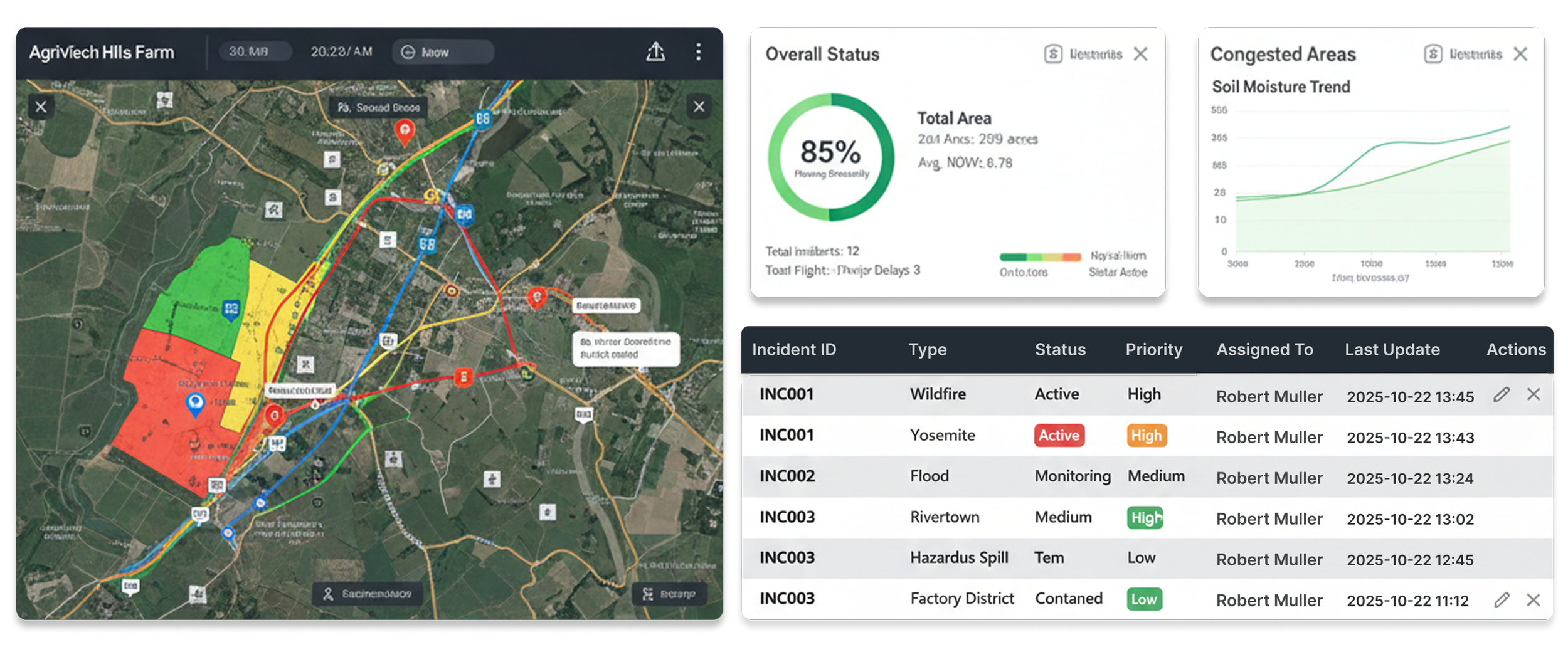
Case Study
To illustrate my design-thinking process, I’ll use a medium-sized ticket, the "Simlu Feature", as an example. This brand new feature was designed to help wildfire response teams simulate and visualize fire behavior in real-time, enabling faster and more informed decision-making. While the design process is never linear, my general six steps were:
1. User Research
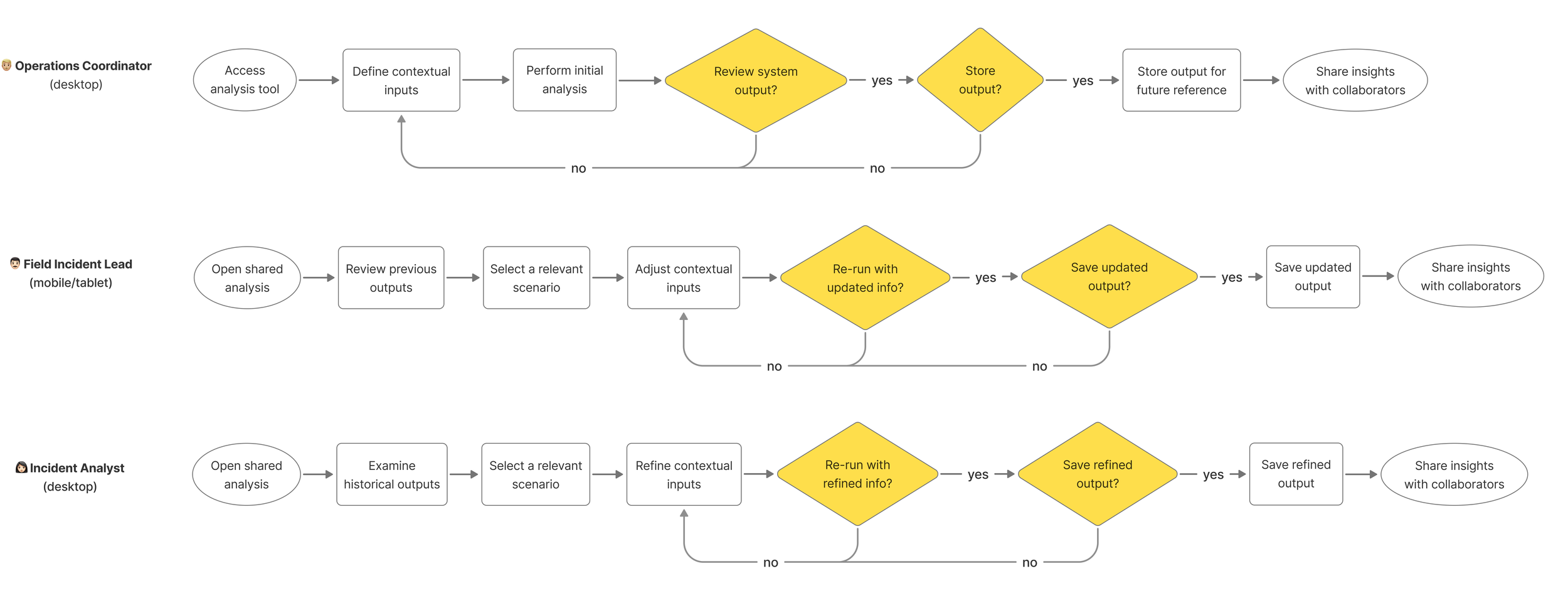
Through quantitative research and qualitative user interviews (using MoSCoW & laddering methods), I worked closely with the product manager to identify the key personas and their main needs:
Enable cross-functional coordination
Ensure flexibility in adjusting input data
Based on these insights, I created a workflow diagram (right) and three detailed user flows (below) to illustrate their interactions with the fire spread feature.
5. Prototyping & User Testing
After several rounds of iteration, I created the final prototype, which gladly received positive feedback from users during testing. The testing sessions went smoothly, validating our design direction and confirming its effectiveness in meeting user needs. 🎉
User flows for three main personas
2. Technical Feasibility Study
After identifying user needs, the next step is to collaborate with data scientists to align on technical feasibilities and uncover potential constraints—such as whether mobile devices can support the required internet speed for running simulations.
This step is crucial for gaining a deep understanding of backend data processing and modeling, enabling me to bridge complex data into a seamless, user-friendly experience.
3. Ideation
Based on insights from user research and technical constraints, I designed data-driven UI elements, categorized them into four types, and explored different layouts for desktop and mobile.
These elements allow users to input data, interact with datasets, and generate insights or visualizations.
4. Feedback & Iteration Again
I presented multiple design options to the product manager and development team. This step was crucial, as their feedback helped identify missing elements, edge cases, and technical constraints.
Challenges & Lessons: With limited resources and low UX maturity, design was often overlooked. I learned to frame design in non-design terms, prioritize high-impact, low-effort improvements, and use data to gain buy-in.
Challenges & Lessons
With tight deadlines and limited access to users, I need to make quick design decisions independently. Working with cutting-edge technology meant few industry references were available. Lessons learned:
Deep User Understanding – Trying to dig deep for real user needs instead of surface-level requests.
Deep Data Comprehension – Collaborating closely with data engineers and data scientists to deeply understand backend data processing. This ensures that data visualization is not only intuitive but also aligning with user real needs.
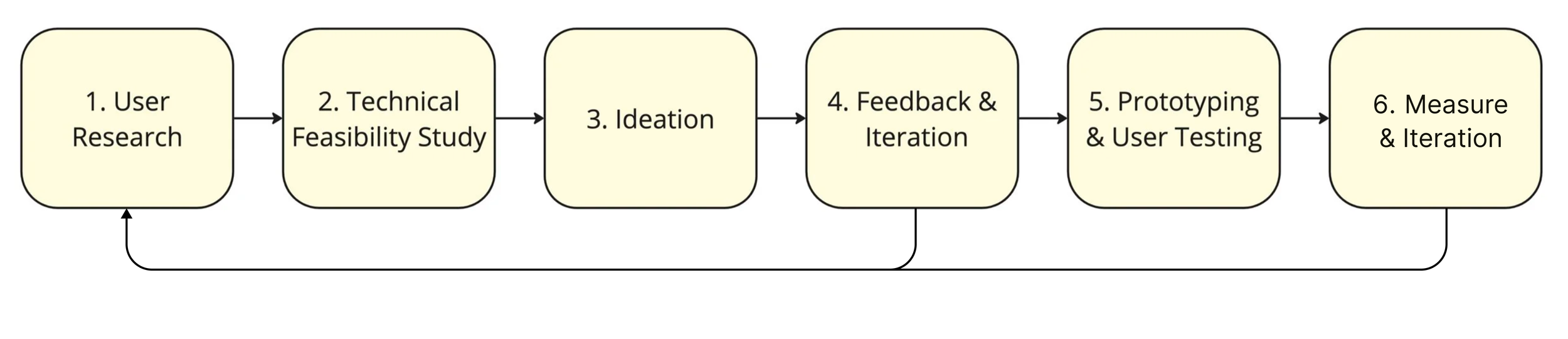
Six-step process for new feature design
Simplified workflow diagram illustrating multi-role collaboration during incident response

Annotated sketch created to understand backend data relationships
Abstracted draft for interactive data elements & data visualization components
Using Product Analytics to Inform Design Decisions (Illustrative)
6. Next Step
Since this is a new feature, it’s crucial to monitor its usability and continue refining it in future iterations. To facilitate this, I defined and implemented analytics tracking events to assess user interaction patterns and feature performance.
2. MEASURE UX
Overview
The other half of my tasks focused on measuring UX. I established a six-step framework to connect user insights with measurable outcomes, and completed the first three steps in close collaboration with a front-end developer to inform early design decisions.

Six-step process for measuring UX
1. Map User Journey + 2. Identify Usability Issues
I created a structured workflow to translate complex processes into clear, actionable steps. By mapping user journeys across key customer groups and validating them with internal stakeholders and external inputs, I identified recurring usability issues that informed persona-specific design decisions.
Challenges & Lessons
Measuring UX can be an ambiguous task, and this was my first time tackling it. To approach it, I began by outlining a rough roadmap based on my own research. I then sought validation by attending specialized workshops, such as Vitaly Friedman's "How to Measure UX and the Impact of Design." Lesson learned:
No need to fear the unknown – just keep researching, stay open-minded, and you'll find valuable insights along the way!

My workflow to map user journey
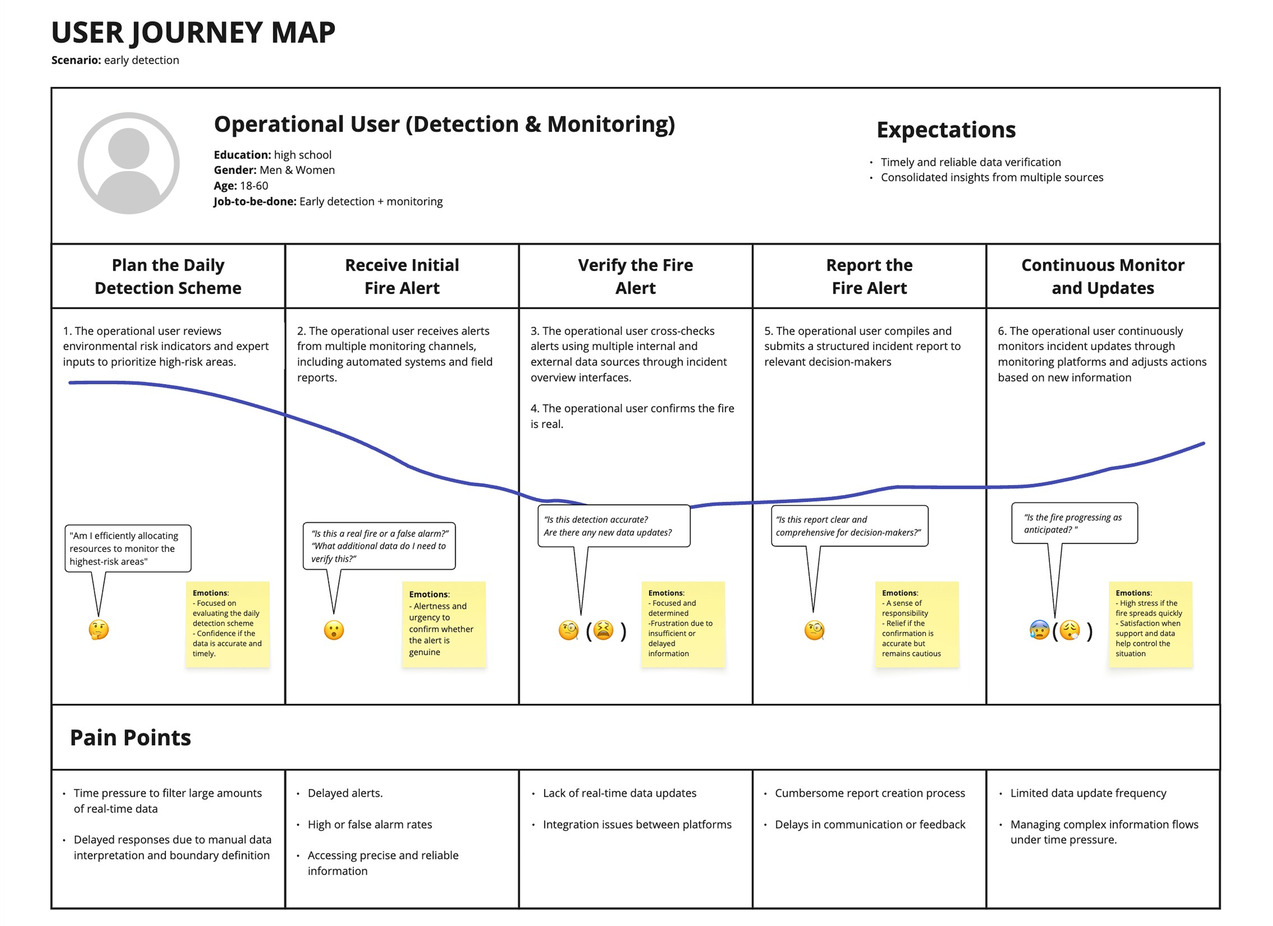
User journey map for operational user
The journey maps emphasize decision-making patterns, emotional shifts, and communication touchpoints at each stage, helping surface UX opportunities across personas.
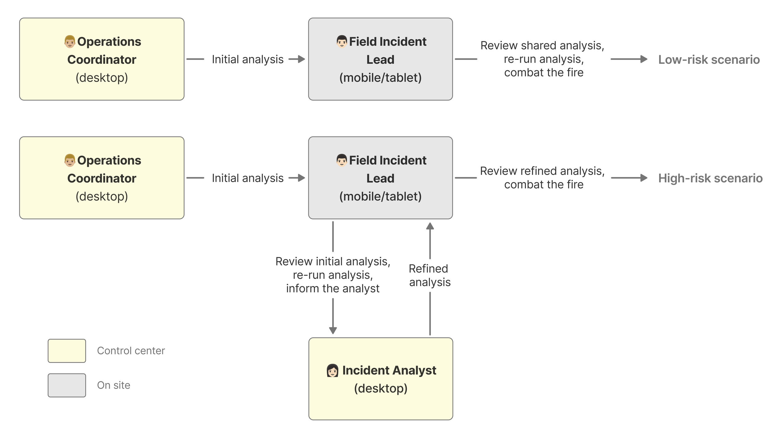
To complement the individual journeys, I mapped a cross-persona workflow (right) to illustrate how different roles collaborate, including reporting relationships and the sequence of actions during incident response.
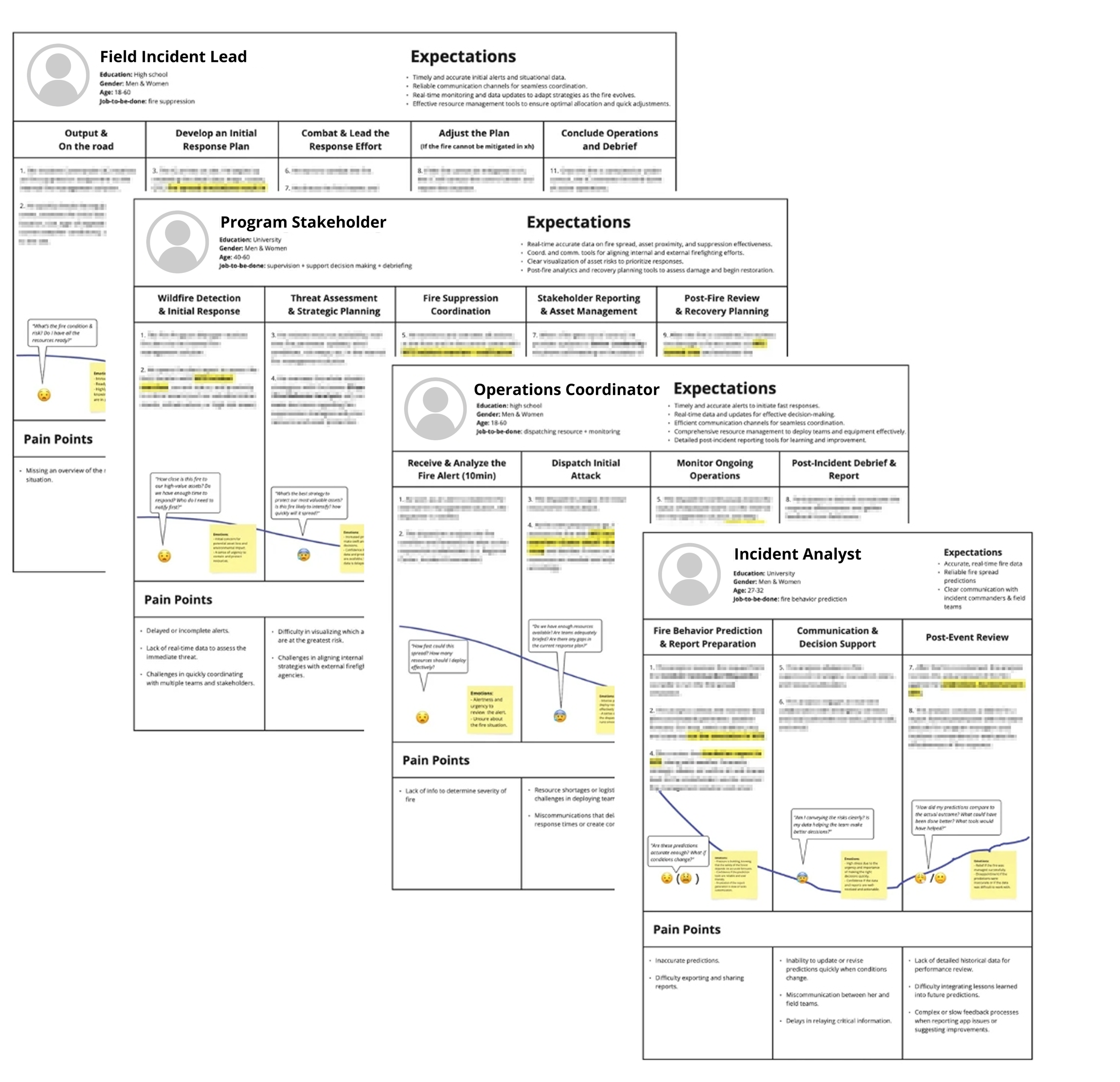
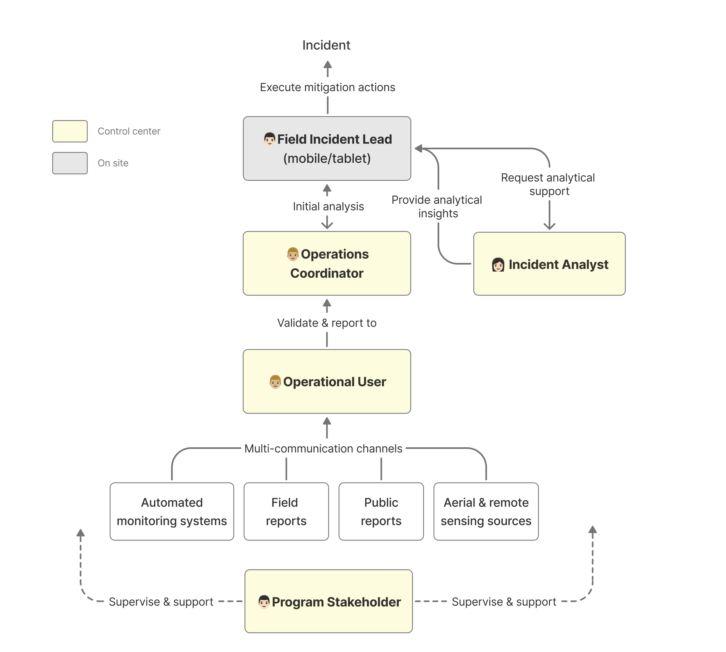
Simplified workflow diagram illustrating multi-role collaboration during incident response
3. Define Key UX Metrics
I collaborated with a front-end developer to define key UX metrics and establish feasible measurement approaches.
These metrics were designed to provide data-informed insights into usability issues, their root causes, and the impact of design improvements.
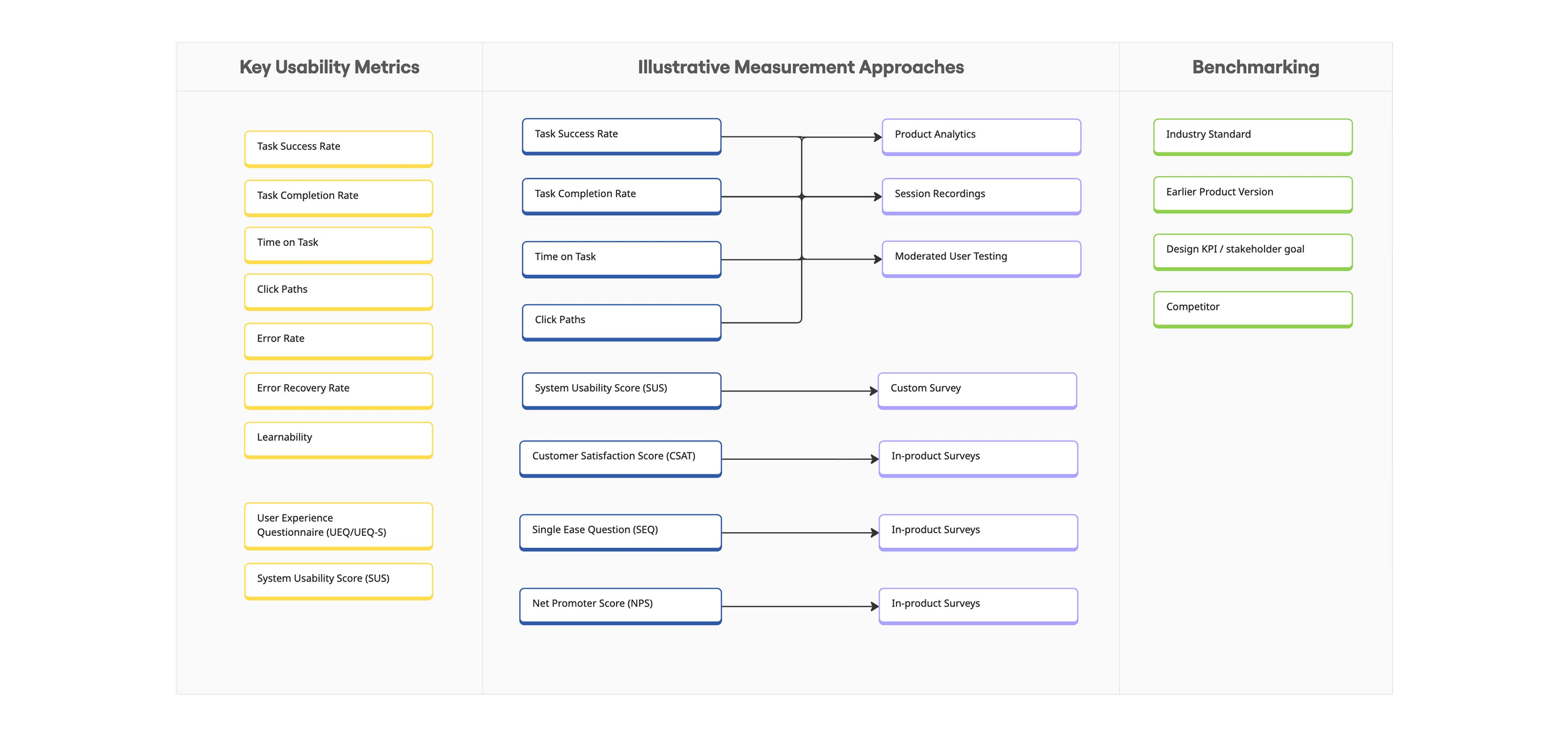
An Abstracted Framework for Defining & Measuring UX Metrics
Thanks for reading this far!
ROLE
Research & Design
TIMELINE
6 Months
TOOLS
Pen & Paper
Figma
Miro
Posthog
AI-assisted tools